


2
Naturya Sport Launch Plan
7
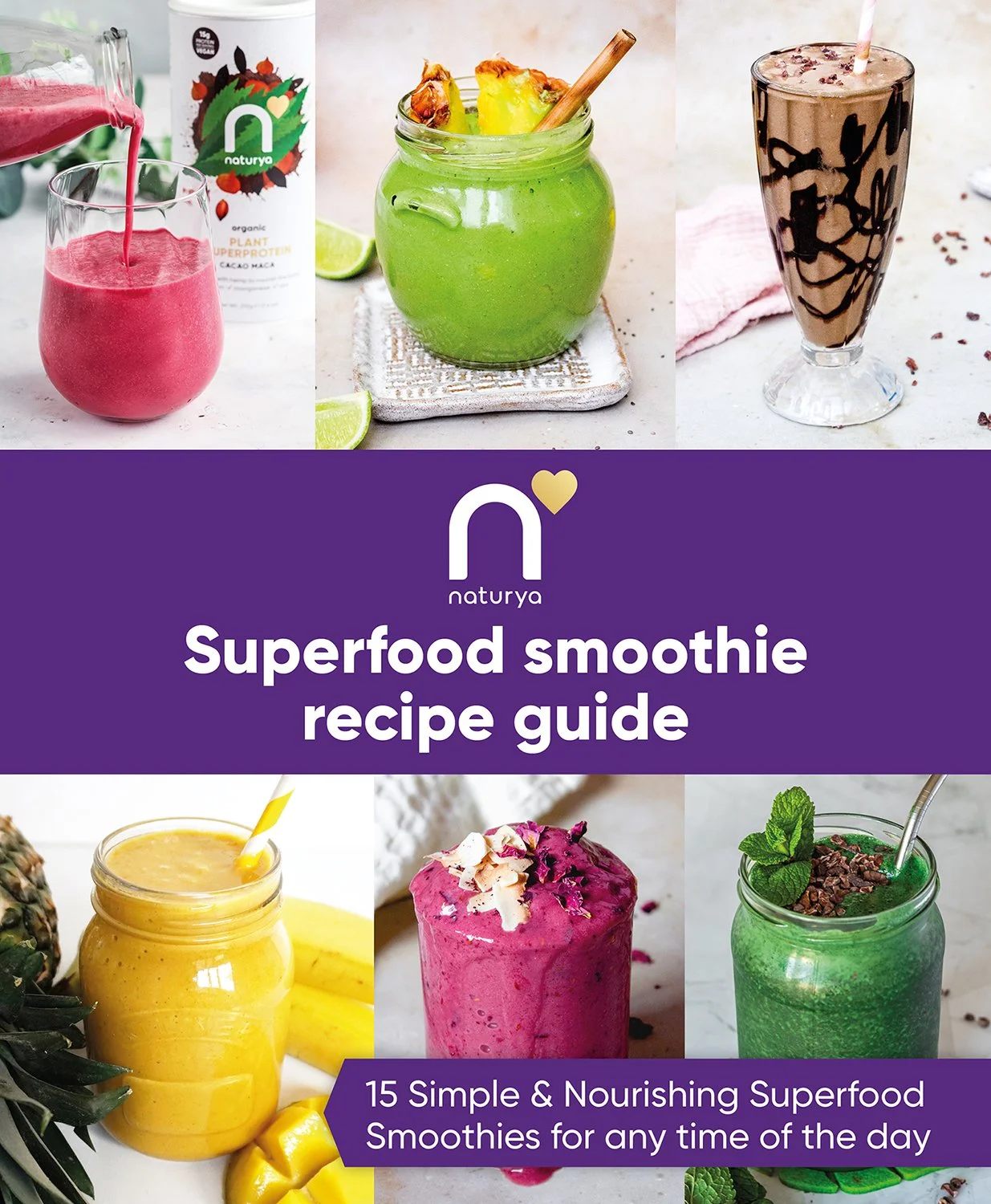
Smoothie E-Book

1
Protein Ball Launch Assets
1
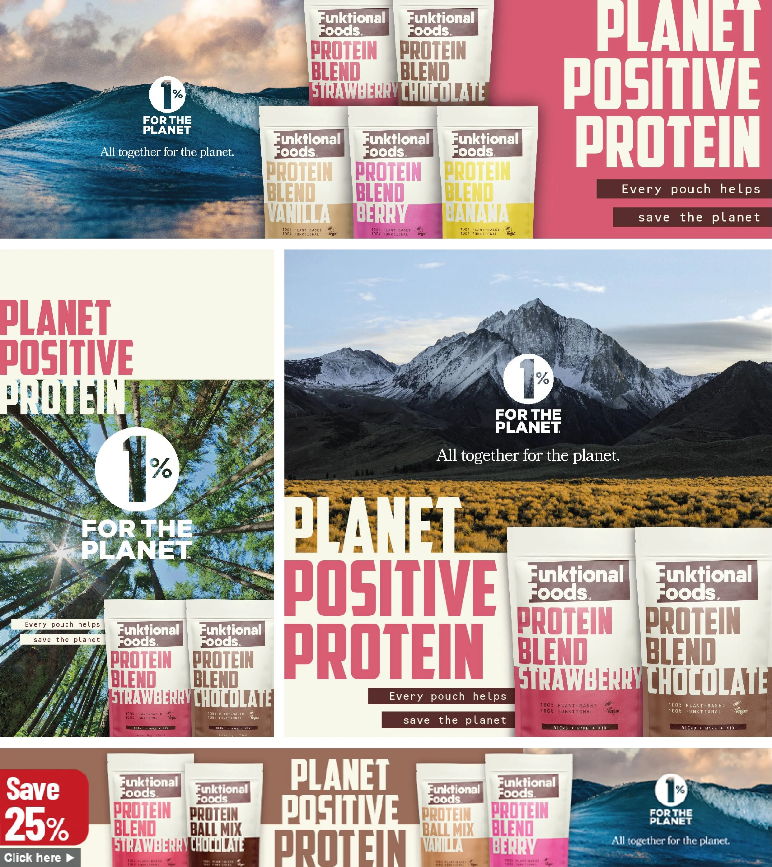
Planet Positive Protein Campaign

4
SuperAge Launch Assets
4
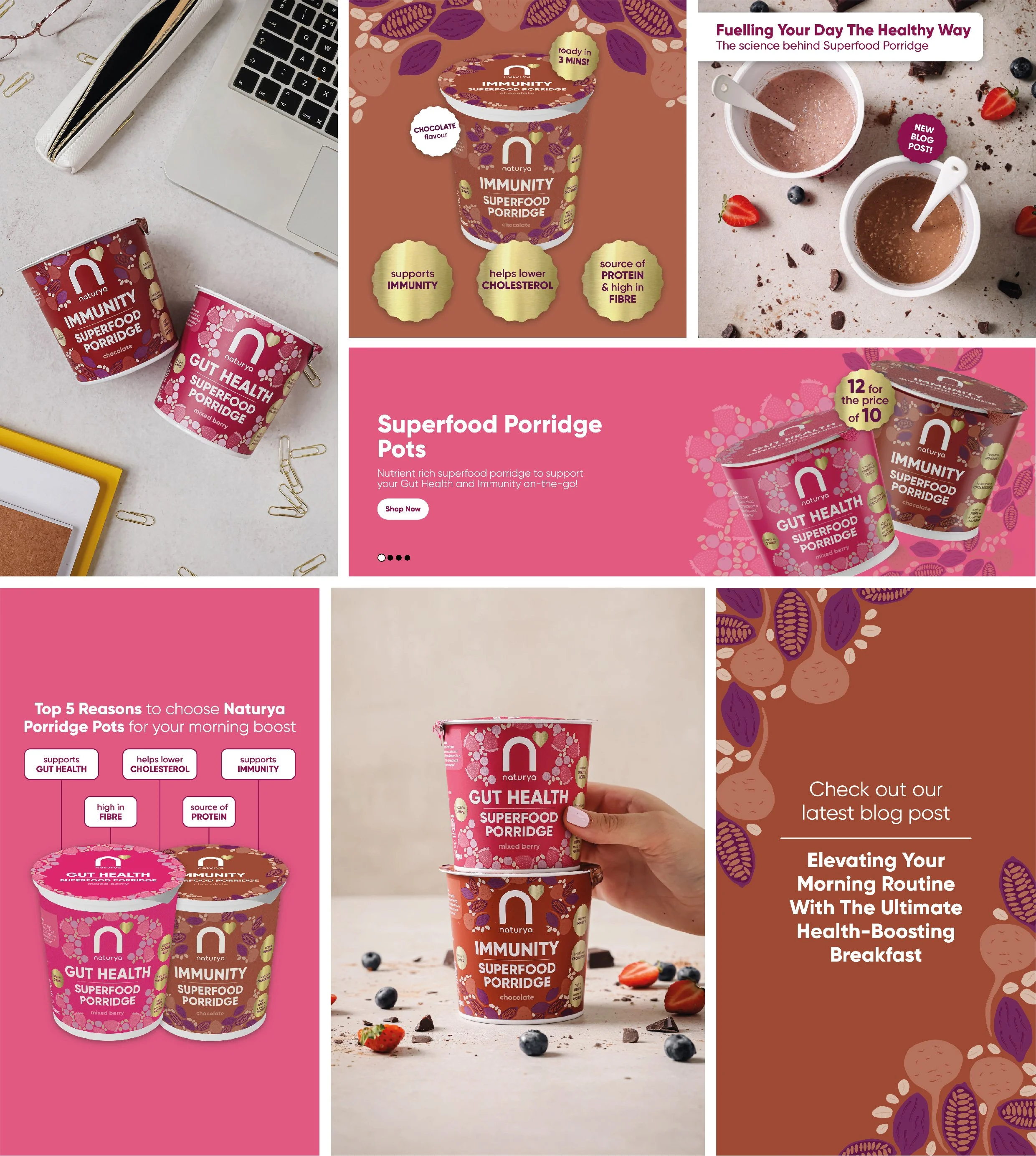
Superfood Porridge Launch Assets
4
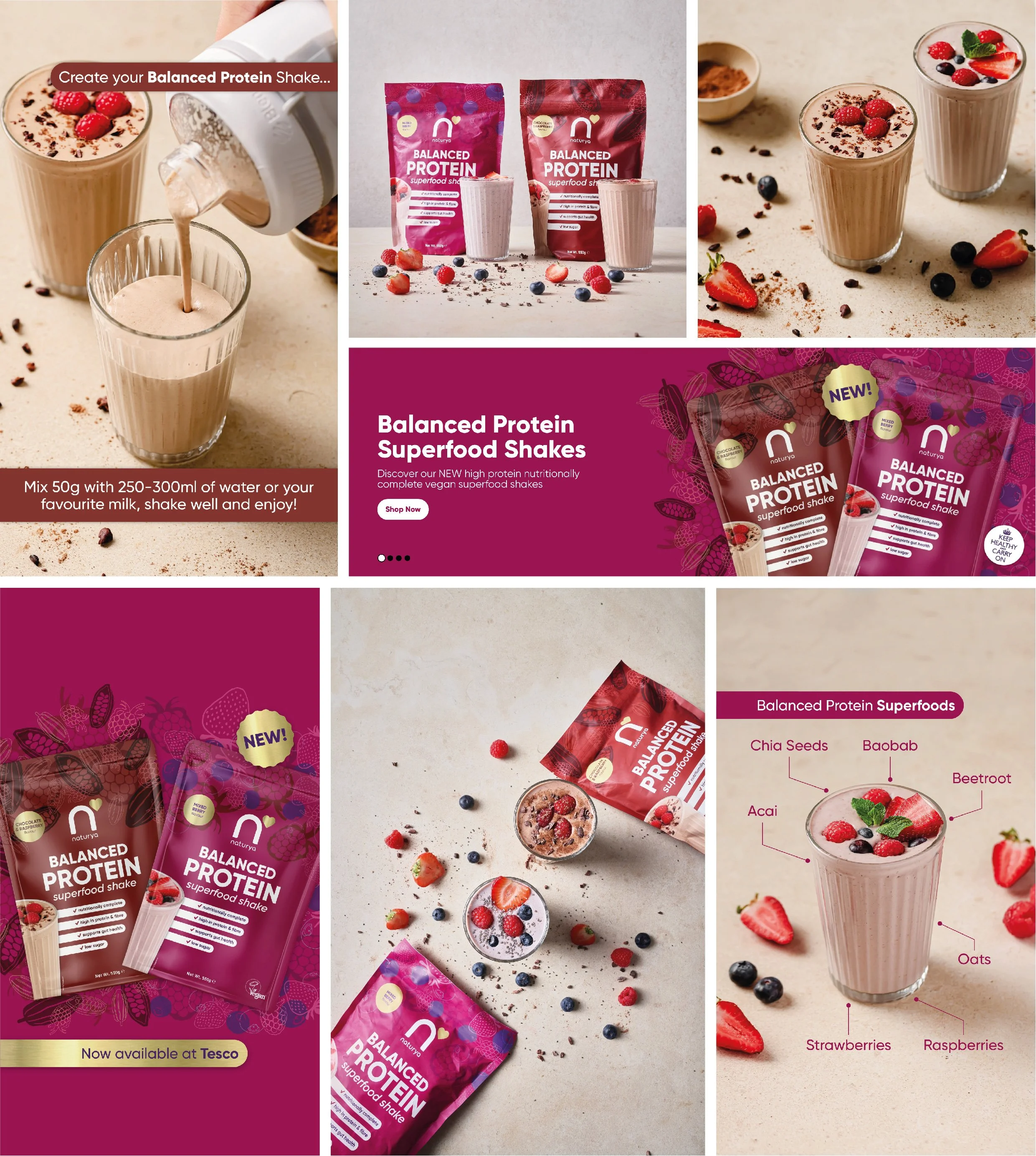
Balanced Protein Launch Assets

7
Instagram Carousels
3
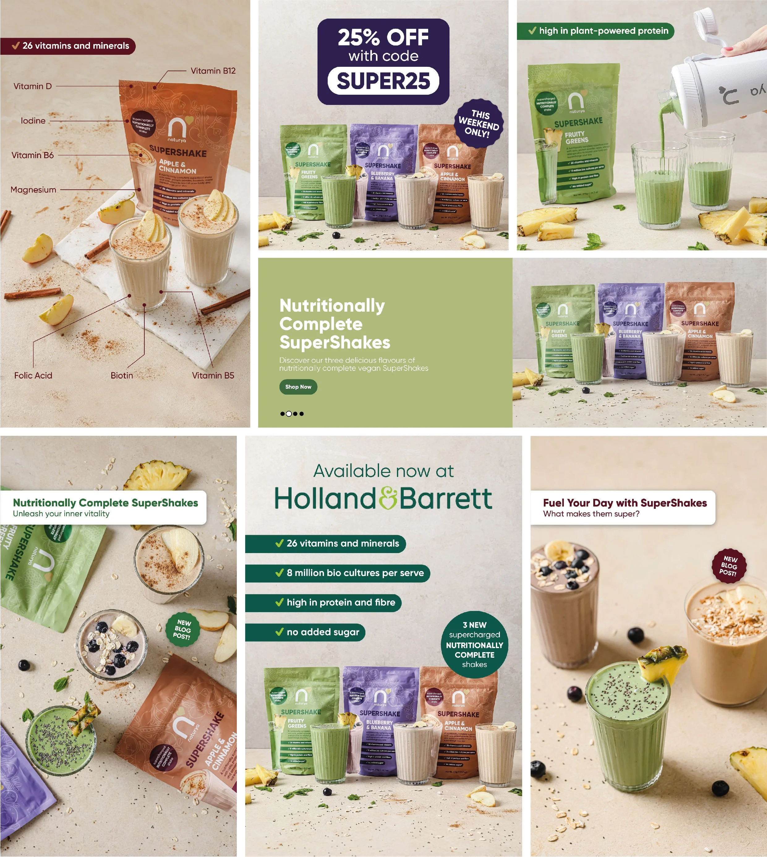
SuperShakes Launch Assets

1
Social Ad Guidelines

3
Naturya Web, Email & Social
4
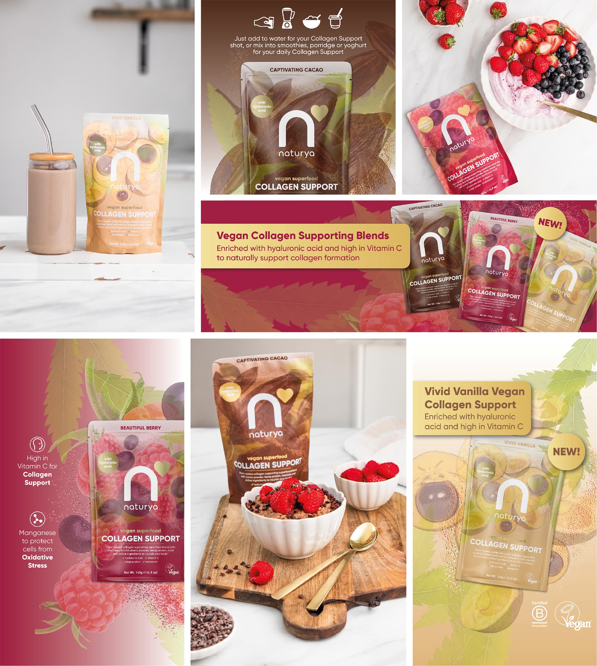
Collagen Support Launch Assets
2
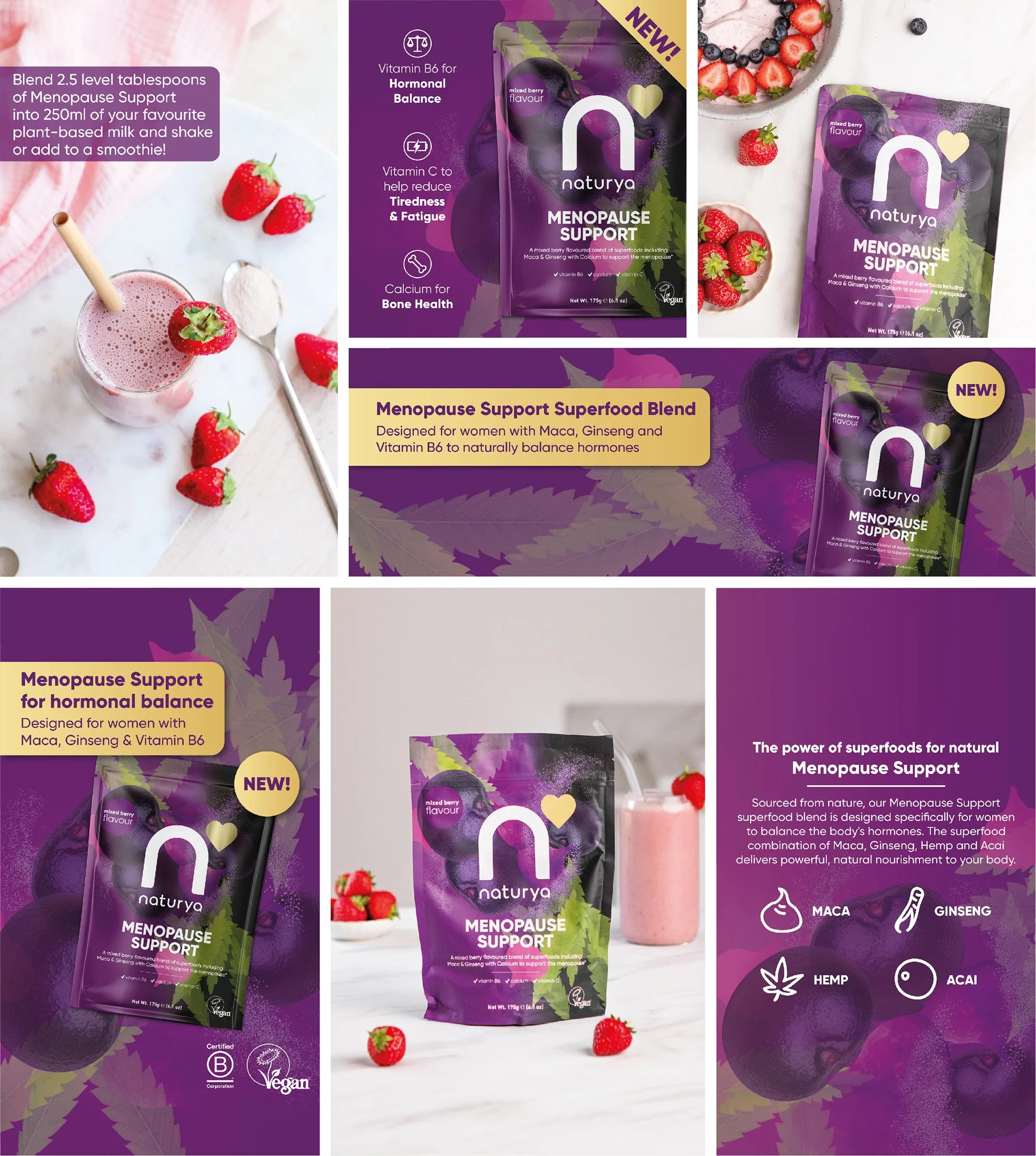
Menopause Support Launch Assets

1
Funktional Foods Web, Email & Social

3
NPD Launch Assets
3
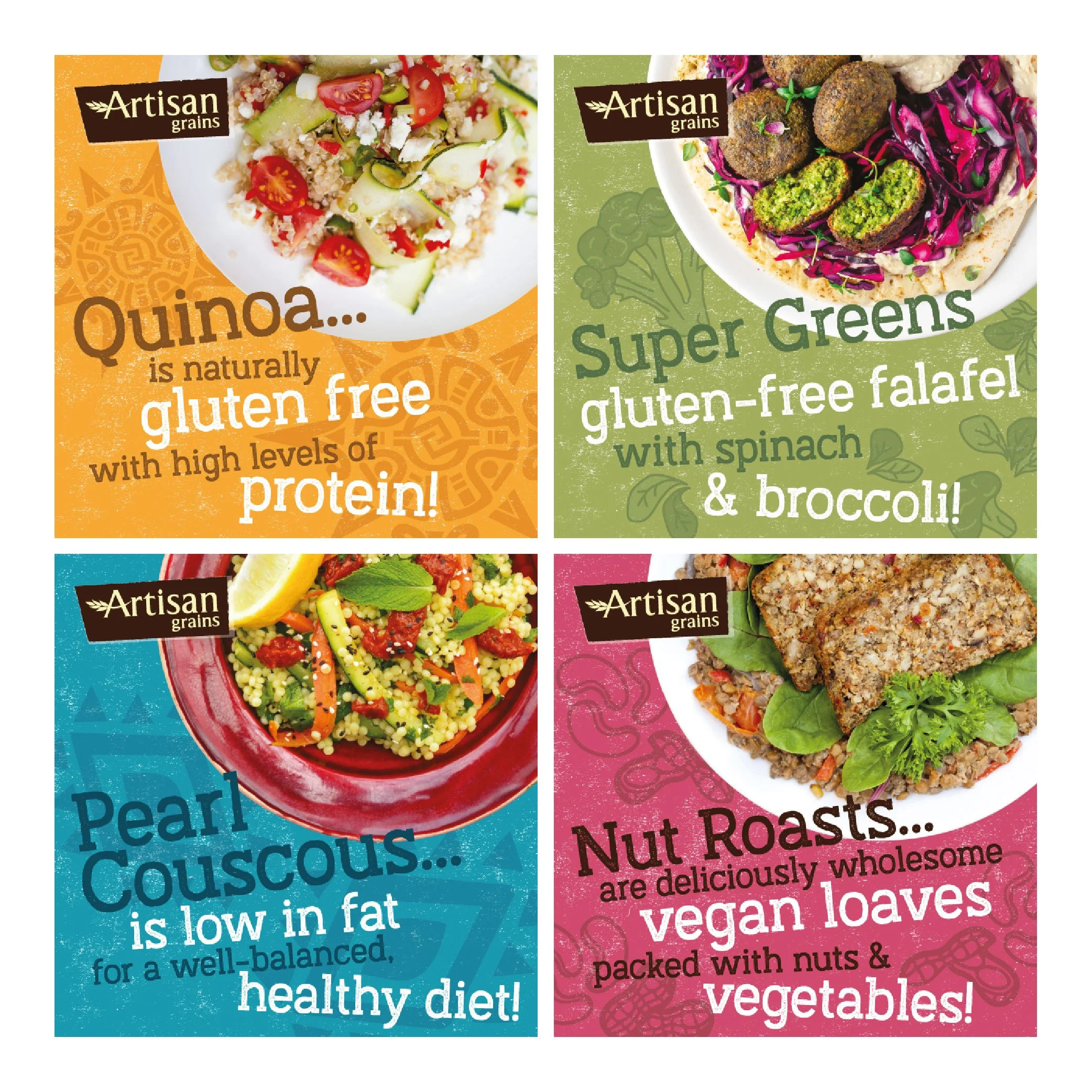
Artisan Grains Social Media